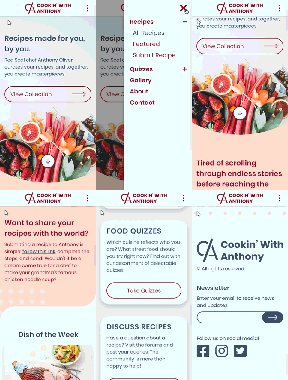
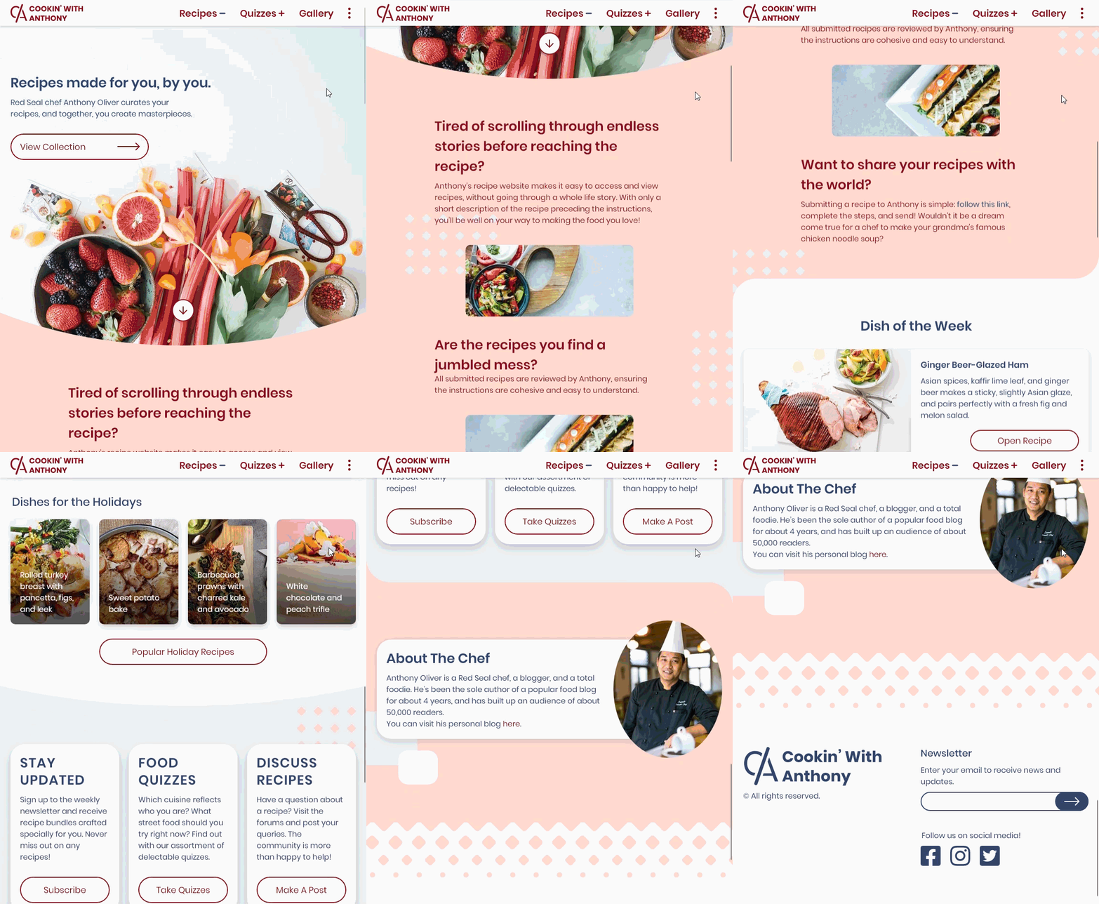
Cookin' With Anthony is a recipe website for which I designed a high fidelity wireframe. I created the landing page with the focus of engaging visitors to explore further into the website. The landing page needed to stand out from other websites while maintaining fundamental design and typography principles. In addition to a landing page, I also created a style guide for the website to pass on to other designers.
The Project
Tools & Methods
Adobe XD, Adobe Photoshop, Wireframing, Visual Design, Branding
The Product
Reflection
My biggest challenge was thinking of content to add to the landing page that would encourage users to delve into the website. Developing the content hierarchy was difficult as well, but after sharing with peers, I better understood what users want to see first on a website. I started off placing the information about the website further down the page as I was focused on engaging users. Once I discussed with others, I shuffled the sections around and finished with the about section at the top in order to educate users on what the website is about.
At the start of the project, I also chose a colour palette that did not have enough contrast. I wanted to stay in my original palette of peach and blue which matched the banner, and tried out combinations of darker shades of orange and bordered on browns. I was very particular with the palette, and was not satisfied with any of those. I was ultimately able to find redder shades that still matched the banner.
Creating the style guide helped me organize my design choices and maintain consistency.


